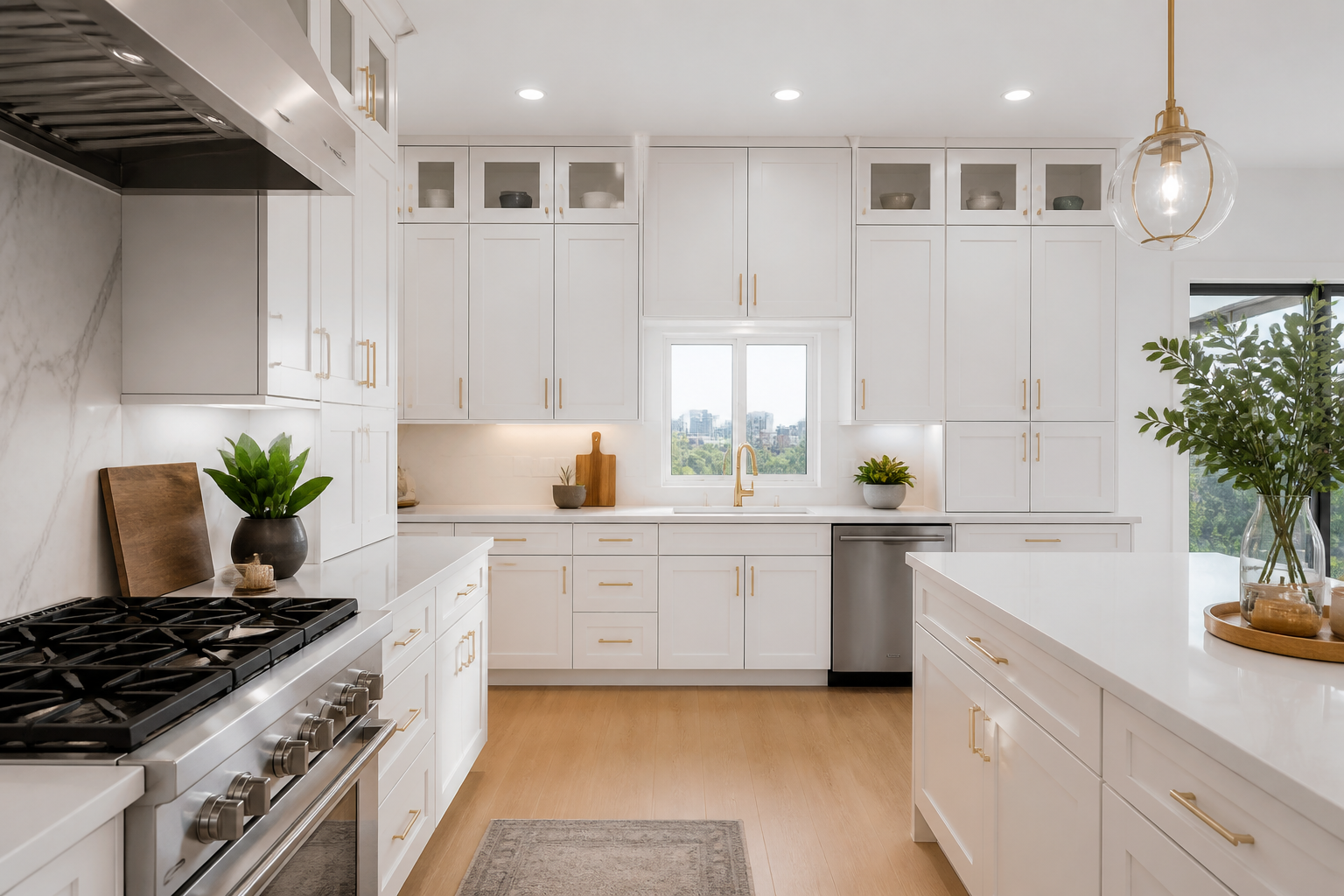
White kitchen cabinets are not a single look. They are a lighting problem, an undertone problem, and a proportion problem that happens to share a color name. I have walked into rooms where “white” read as hospital blue at 4 p.m. and rooms where the same catalog door read as cream next to an oak floor. The cabinets did not change. The north window, the bulb, and the counter slab did.
If you are planning white kitchens in an American house, you are usually trying to do three things at once: bounce light in a room that may not have enough of it, keep resale broadly appealing, and avoid the sterile box that everyone claims to be tired of. Those goals are compatible if you treat white as a system — paint, sheen, metal, stone, and the color of the light — not as a default checkbox.
A photorealistic overlay on your own room photo can show whether a cool white makes your galley feel icy. That is a fair use of an AI planner such as Best Kitchen Design. Confirm every white in person. No screen is honest about a white door.
Undertones, Light, and Why White Misbehaves
White always has an undertone. It leans gray, blue, green, yellow, or pink once it is next to something else. The something else in a kitchen is usually a floor, a slab, a stainless appliance, and the sky. A north-facing kitchen in New England takes cool daylight. The same door in a west-facing Phoenix breakfast room takes warm late light and will yellow in your memory even if the paint chip did not.
I sort whites into four working groups for kitchen cabinet design:
Cool whites have gray or blue in them. They look crisp with honed gray quartz, chrome, and pale porcelain floors. They punish yellow oak cabinets leftover from a partial remodel and they fight creamy marble. If your house has warm brick or honey floors, a cool white can make the kitchen feel like it was dropped in from a different building.
Neutral whites are the workhorses. They stay out of the way of both oak and walnut, and they let you change hardware later. “Neutral” is not the same as “builder beige.” You still have to sample. Hold the door next to your floor in the morning and after dark.
Warm whites and soft creams are how you keep a white kitchen from feeling like a lab. They sit well in craftsman and farmhouse houses, with unlacquered brass, with unlacquered nickel, and with butcher block. They can look dingy if the lighting is too cool or if you pair them with a blue-gray wall.
Greige-whites — white with a noticeable gray-beige — were everywhere for a decade. They can still work if the rest of the house is in that family. They look dated when they sit next to a stark quartz that was sold as “calacatta” and is actually a high-contrast photocopy.
Lighting is half of kitchen cabinet design for white doors. Recessed cans on a cool daylight LED will push a warm white toward yellow and a cool white toward ice. Use a consistent color temperature through the kitchen and adjacent rooms. Dim the ambient layer at night so the white planes recede and the wood or stone can carry the room. Under-cabinet lighting should be even and shielded; a spotted LED tape turns a white backsplash into a dental office.
Natural light wants a job. If you have a window over the sink, keep the upper cabinets from crowding it. A thick valance of white doors around a small window is how white kitchens start to feel boxed. If you have little natural light, white still helps, but only if the bulbs are decent and the surfaces are not all the same flat sheen. Mix a soft matte door with a slightly more polished stone, or a honed counter with a painted door that has a gentle sheen. Two identical matte whites stacked — door and wall — erase corners and make the volume harder to read.
Sheen is a design tool. A dead-flat paint on a busy family kitchen will scuff on the stile edges. A high gloss on every door will show every knuckle print. Factory finishes in a satin or soft matte are the usual compromise. On an island you touch constantly, consider a different material rather than a tougher white: wood, a painted mid-tone, or a stone face.
Pairing Counters, Floors, and Metals With White
White cabinets do not fail on their own. They fail in combination. Kitchen cabinet design is a set of neighbors.
Counters: A quiet white or softly veined quartz keeps the cabinets in the same family and can look washed-out if everything else is also white. A warmer stone — cream marble, a taupe quartz, a lightly toasted porcelain — gives the eye a place to land. A dark counter (soapstone, black granite, deep green) is the classic contrast move. It grounds the room and hides the coffee ring. It also demands that you finish the room: a dark counter with white doors and a pale floor can look top-heavy unless the island or the floor has some weight.
Veining should not compete with tile. If the slab is athletic, the backsplash should be calmer — a matching slab return, a simple handmade rectangle, or paint if code and splash allow. If the slab is quiet, the tile can take a shift: a zellige with variation, a narrow vertical stack, a stone mosaic in a small run.
Floors: White kitchens on yellow oak need a decision. You can refinish the oak cooler or darker, you can let the contrast be rustic on purpose, or you can change the floor. What rarely works is pretending the yellow is not there. White oak, whitewashed oak, and large-format porcelain in a stone or limewash look are the easier partners. Terracotta and brick-toned tile can be beautiful with creamier whites and terrible with blue-whites.
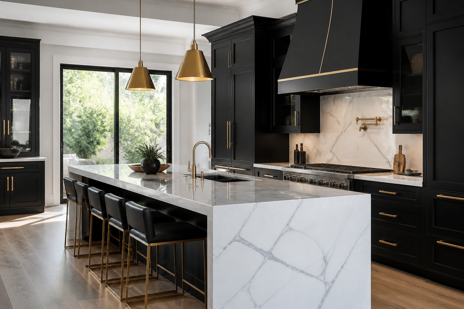
Metals: Stainless will always be in the room if you have a standard range. Decide whether stainless is a material you lean into or a material you minimize with panels. Chrome and polished nickel stay crisp with cool whites. Brass and champagne bronze warm a white kitchen that would otherwise feel sterile. Black metal is sharp with white shaker and can feel rental-trendy if every fixture is the same matte black set from one big-box aisle. Mix with a dominant metal and a supporting metal, not a tie score.
Walls: Painting the walls the same white as the cabinets can look tailored in a room with good trim and good light. It can also flatten a small kitchen. A half-step deeper wall — a warm plaster, a pale greige, a soft clay — throws the cabinets forward. In open plans, the kitchen white has to shake hands with the living room. If the adjacent room is a saturated color, sample the cabinet door against that wall, not against a white foam core in a warehouse.
Backsplash height changes the architecture. A short four-inch backsplash of the counter material is quiet and a little dated. Full height to the uppers is cleaner in white kitchens because it reduces the number of horizontal stripes. A window wall with a slab or a simple tile looks more expensive than a busy mosaic fighting white doors for attention.
Hardware scale should match the door style. A tiny knob on a tall white pantry looks timid. A long bar on a small drawer looks like it was specified from a spreadsheet. On white shaker, cup pulls on drawers and knobs on doors is a combination that still feels considered. On white slabs, a thin bar or an integrated pull keeps the plane.
Keeping White Kitchens Warm, Not Sterile
The complaint I hear about white kitchens is not that they are white. It is that they have no shadow, no wood, and no place for the eye to rest. Warmth is not a farmhouse cliché. It is contrast and material.
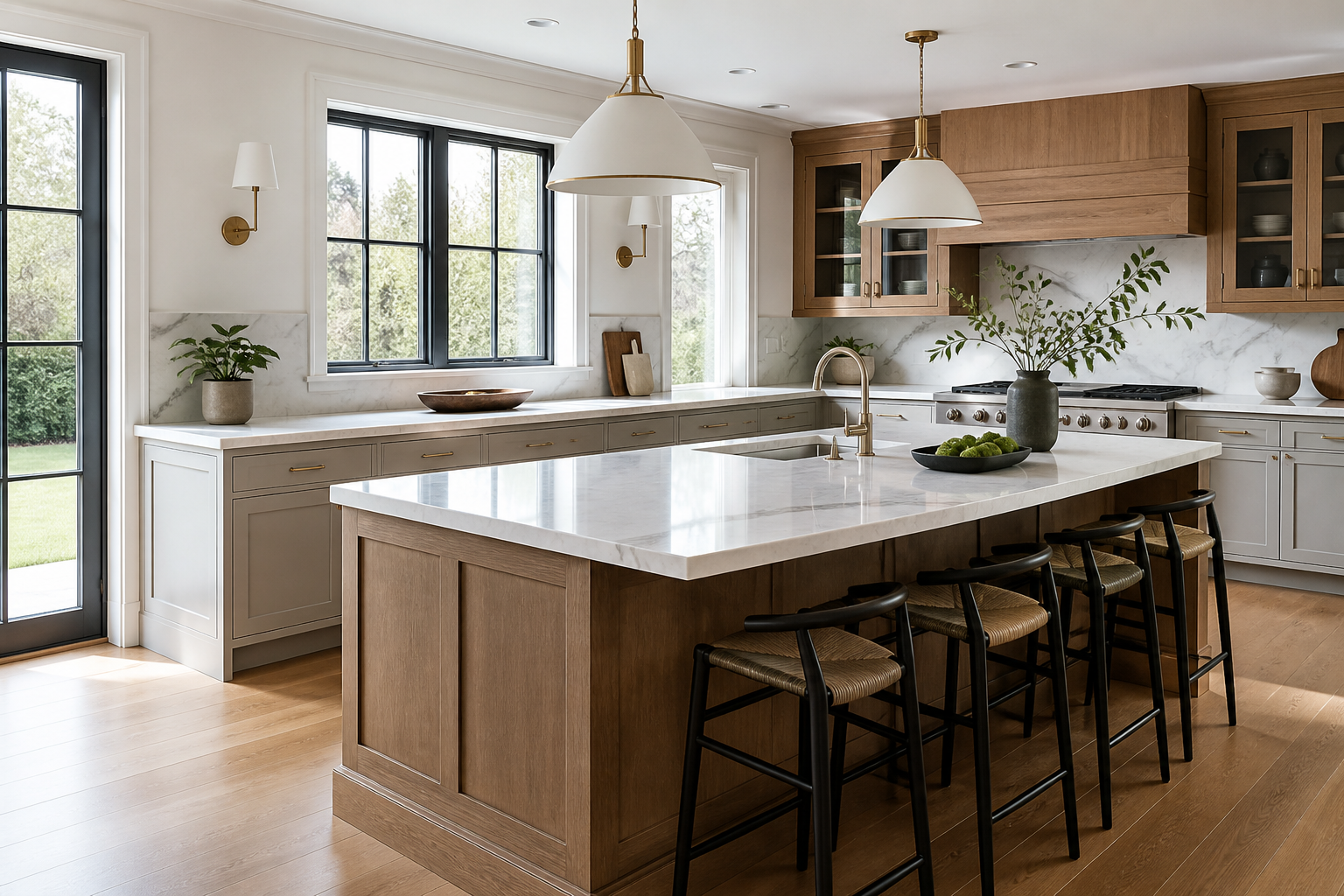
Add one honest wood: an island, a range hood wrapped in oak, a walnut open shelf that is short enough to style, or the table you already own. One wood species is enough. Three woods plus white doors is a lumberyard.
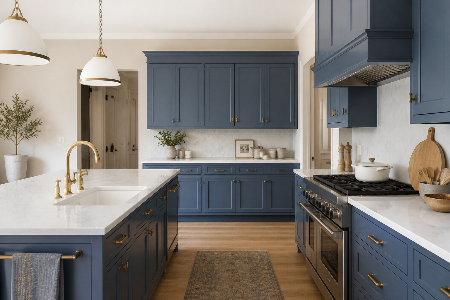
Add one deeper color in a controlled dose: a dark green window frame, a navy island, a plaster hood, a row of amber glass, a runner that is not gray. White kitchens that only add gray accessories still feel like a catalog.
Mind the verticals. Full-height white pantries next to a white fridge panel next to white uppers is a lot of plane. Break it with a reveal, a change in depth, a tall open niche, or a hood that is a different material. Proportion is why some white kitchens look custom and some look like a row of lockers.
Think about the fifth wall. A white kitchen with a builder-white popcorn ceiling will never look resolved. If you cannot respray the ceiling, at least get the lighting clean and the crown or reveal intentional. If you can paint the ceiling a soft warm white different from the cabinets, the room starts to have atmosphere.
Style the counters less than the internet suggests. White kitchens show clutter. That is a storage problem, not a styling problem. Build the appliance garage, the tray garage, and the charging drawer so the white plane can stay a plane. A single wooden board and a lamp on a peninsula is enough. A forest of canisters undoes the architecture.
Consider the house. A 1920s bungalow with white inset cabinets, a honed marble, and unlacquered brass is a different white kitchen than a 2018 spec house with slab doors and a gray quartz. Both can be good. Copying the first into the second — or the second into the first — is how white kitchens look like costumes.
If you are nervous, use white on the perimeter and put personality on the island or the hood. That is a reversible hierarchy. Painting a whole kitchen a second time because the first white went gray-blue in February is a job nobody wants.
Sampling, Upkeep, and a White Cabinet Spec You Can Live With
Order doors, not chips. A two-inch paint chip will not tell you how a five-piece shaker looks at 30 inches wide. Get a full door if the shop will lend one. Stand it against the wall, against the slab sample, and against the floor. Look at 8 a.m. and 8 p.m. Photograph it with your phone only as a memory aid; do not pick a white from the photo.
If you are using a visualization tool, try at least two whites on the same photo — one cooler, one warmer — plus a version with a wood island. Best Kitchen Design is useful here because the room geometry stays put while the finish changes. Then ignore the screen and believe the physical door.
Ask how the white is made. Factory paint on MDF or maple is a different product than a spray-bombed oak door with open grain that will telegraph through white. Grain telegraphing is the ghost of oak under a thin white film. If you want a smooth white, you want a smooth substrate.
Plan for wear. White shows chips on outside corners, around dishwasher edges, and on the trash pull-out. Specify bumpers, soft-close, and a trash can that does not slam the door. Keep a touch-up kit from the same batch. Wipe with a mild soap, not a mystery cream that leaves a film. Grease on white uppers near the range is a ventilation problem: get a hood that vents and that you will actually run.
Grout and caulk are part of the white kitchen. A bright white grout will discolor; a slightly warmer or grayer grout hides more and can look more designed. Caulk lines that yellow will ruin a crisp white run. Use the products your tile setter specifies for kitchens, not leftover bathroom caulk.
Resale is the reason many people choose white cabinets. Broad appeal is real. Timelessness is not automatic. A white kitchen with cheap doors, cool gray everything, and no wood will age as a period room just like honey oak did. Invest in the boxes, the finish quality, and the lighting. The color name will take care of itself.
Frequently Asked Questions
Do white kitchen cabinets make a small kitchen look bigger?
They can, if you also manage sheen, lighting, and clutter. White bounces light; it does not add square footage. A small kitchen with white doors, a dark floor, and no under-cabinet light can still feel cramped. Combine white with a clear counter and a consistent floor.
What countertop looks best with white cabinets?
There is no single best slab. Quiet stones keep the room soft; dark stones ground it; warm stones keep it from going sterile. Sample the actual door next to the actual slab in your light. Online pairings skip the undertone fight that happens in real rooms.
Are white kitchens going out of style?
All-white rooms with gray quartz and no contrast read as a specific era. White as a perimeter color, paired with wood, a deeper island, or a richer metal, remains a practical kitchen cabinet design choice. Style the system, not the trend name.
How do I keep white cabinets from looking yellow or gray?
Match the undertone to your light and your floor, use one bulb color temperature, and sample at night. Yellow usually comes from warm floors plus cool bulbs, or from a cream door under daylight LEDs. Gray usually comes from a cool white next to creamy stone.
Should island cabinets be white too?
Not automatically. A wood or painted island gives a white kitchen a center of gravity and hides the scuffs where people sit. If the room is already visually busy, an all-white island can be the calmer choice. Decide based on the view from the sofa, not the showroom.
Try White Cabinets on Your Actual Walls
White is the finish most people mis-pick from memory. Upload a kitchen photo at bestkitchendesign.com/create and compare warm, cool, and two-tone white kitchens in the light your windows already provide.
Plans are billed through Polar: Mini at $14 a month, Personal at $18, Premium at $36. Details live on pricing. Use the images to short-list two whites, then spend your money on a real door sample — that is the only white that matters.